
Working with the Timeline View
Overview
The Timeline View lets you examine your process in terms of its temporal behaviour. Structurally it mirrors the Pattern View: the right-hand panel houses the Representation Options, while the main canvas displays the actual time-based visualisations of the process.
The purpose of this view is to reveal temporal patterns—seasonal effects caused by holiday periods, resource shortages or winter-time sickness, as well as hidden trends such as gradually lengthening cycle times.
Representation Options
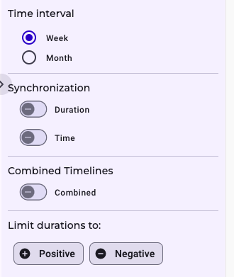
Within the representation options you first choose the Time Interval. Selecting Week or Month immediately switches the X-axis of every time widget to the corresponding scale.
Next come two synchronisation modes. Synchronise by Duration aligns all widgets on their Y-axes, so the same duration occupies the same vertical position everywhere.
Synchronise by Time locks the widgets on the X-axis; draw a vertical line anywhere and each widget shows the identical calendar moment or calender week beneath that line.
A third switch controls Combined Timelines. When it is off, each activity pair (e.g. from Activity A to Activity B) appears in its own widget, showing how that specific duration evolves along absolute time. When the switch is on, those individual widgets merge into a single, stacked timeline whose coloured segments still distinguish the underlying activity pairs. Clicking a activity pair on the very bottom of the combined timeline toggles its visibility, allowing you to focus on or exclude particular durations.
At the bottom of the panel you can filter out positive or negative times. Choosing Positive hides all negative durations between the selected activity pairs; choosing Negative shows only those negative values. This makes it easy to detect anomalies—clusters of negative times often indicate that the assumed process order does not match reality.
Explanation of the Visualization
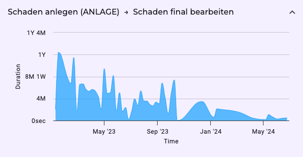
The Time Widget is a compact, self-contained timeline that plots how long it takes to move from Activity A to Activity B over the calendar period you are analysing.
| Element | What it Shows | How to Interpret It |
|---|---|---|
| X-axis (horizontal) | Absolute dates—for example, Jan 2023 → Dec 2025. The full span of your dataset is displayed unless you narrow it with the global time filter. | Scan left-to-right to see how the duration changed week-by-week or month-by-month. |
| Y-axis (vertical) | The measured duration between Activities A and B. Values rise upward for longer times and drop for shorter times. | - Peaks (high points) = periods where A→B took unusually long. - Troughs (low points) = periods where A→B became quicker. |
| Lines or Bars | Each point, line segment, or bar represents the duration for the interval directly below it on the X-axis. | Look for patterns such as gradual upward trends (slow deterioration), cyclical waves (seasonality), or sudden spikes (one-off incidents). |
| Positive / Negative Filter | Positive = show only durations greater than 0. Negative = show only durations less than 0. | Negative values usually indicate an ordering anomaly (e.g., B recorded before A). A cluster of negatives flags data-quality or process-sequencing issues worth investigation. |
| Hover / Tooltip | Hovering reveals the exact date, duration value, and often additional context like case count. | Use this to quantify how much longer or shorter the period was compared with the norm. |
Practical Reading Tips
- Start with Scale: Confirm that the X-axis covers the period you care about. Zoom or filter if you need to focus on a busy quarter or a quiet summer stretch.
- Check for Trend Lines: A smooth upward drift in the Y-axis suggests capacity-related slowdowns; a downward drift hints at efficiency gains.
- Spot Seasonality: Recurring peaks every December or every Q3 typically point to holiday demand, fiscal-year rushes, or vacation bottlenecks.
- Hunt Anomalies: Flip to Negative durations. Any point below zero is a red flag—either an event logged out of sequence or an unexpected parallel workflow.
- Compare Peaks to Context: If an unusually high spike coincides with known events (system outage, policy change), you’ve found a causal clue. If not, mark it for deeper case-level analysis.
- Use Synchronisation (if enabled): When multiple time widgets are aligned by calendar date, draw a mental (or on-screen) vertical line to see how delays in one activity pair ripple into others.
Mastering the time widget means recognising that horizontal = when and vertical = how long. Follow the peaks, valleys, and sign filters and you’ll quickly separate normal seasonal swings from genuine process problems.