
Working with the Pattern View
Overview
The Pattern View is divided into two main sections. On the right-hand side you find the Representation Options, which allow you to switch between different time representations and ordering logics. The main part of the screen shows the Pattern Visualisation, a chart that resembles the familiar dotted-chart display. Its purpose is to let you explore the process data in greater detail and from perspectives that go beyond the classic Process- and Case Views. Here you look for problems or recurring patterns that can later be examined more closely in other views.
Representation Options
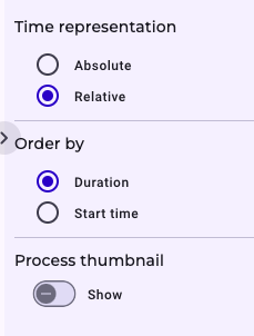
Within the representation options you can choose between two time modes. Absolute Mode displays concrete calendar dates on the X-axis—such as “1 January 2025”. Relative Mode resets the X-axis to zero and stretches it to the maximum cycle time found in the data set, which can span several months or even years. A second option lets you decide how the instances are arranged on the Y-axis. If you order by Duration, the instance with the shortest throughput time appears at the top, while the one with the longest duration moves to the bottom. If you order by Start Time, the instance that started earliest is shown first, and the most recently started instance appears on the bottom.
Explanation of the Visualization
You can also activate a process thumbnail: clicking Show pops up a miniature diagram (identical to the Case View) of the instance selected on the canvas. Each point/element on the pattern view is colour-coded (and sometimes shape-coded) according to its activity type; a legend at the bottom explains which colour or shape belongs to which activity type. Selecting a point draws a horizontal red dotted line across the chart, labelled with the instance ID, making it easy to follow that single case from start to finish. If you have zoomed in, the Reset Zoom button in the top-right corner returns the view to its default scale. Finally, the upward arrow above the Pattern View takes you straight to the Case View of the highlighted instance, where you can investigate it in depth.