
Creating Dashboard Widgets
Overview
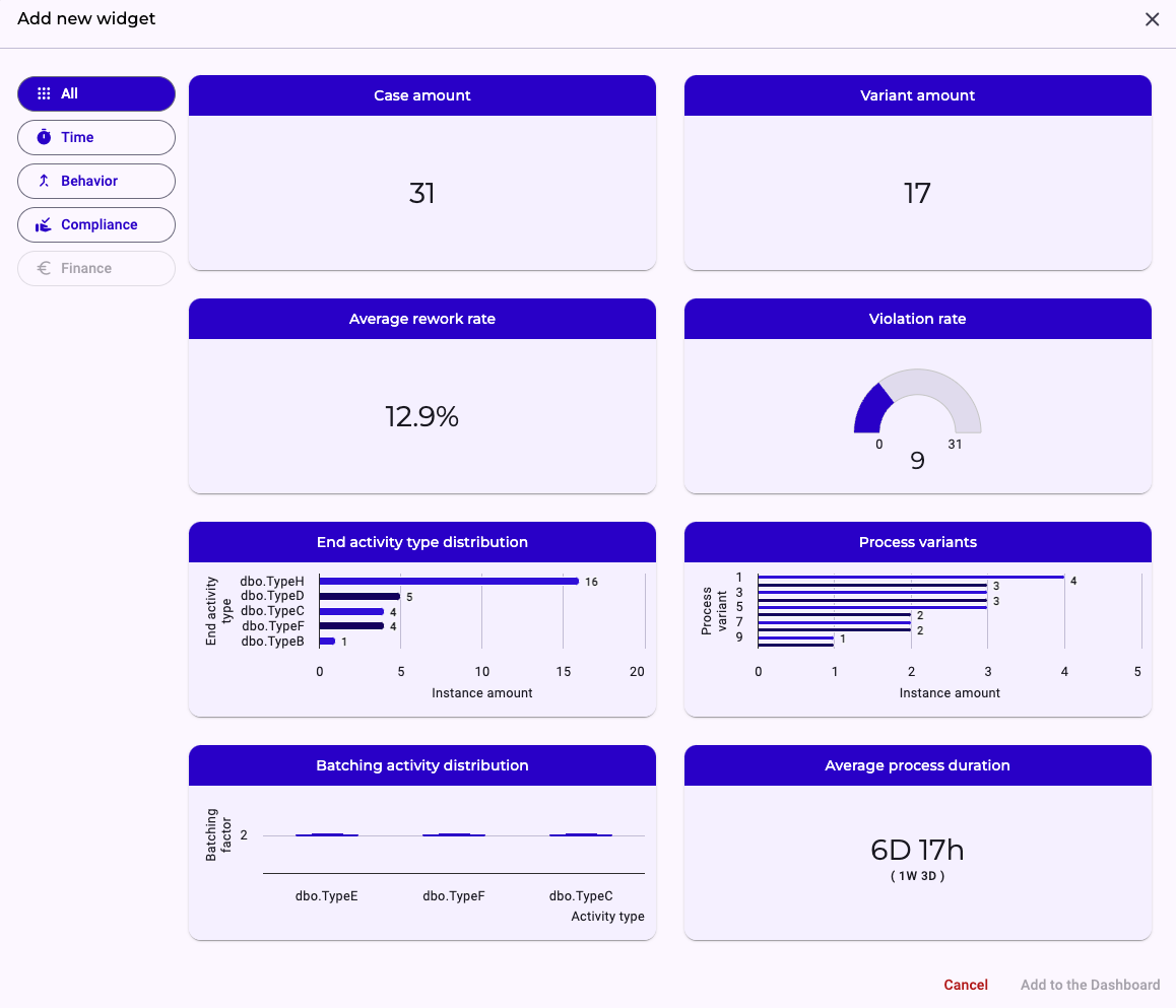
Below is a concise overview of the Dashboard’s available widgets. Each widget offers a unique lens on your process data—whether you’re tracking volumes, timing, deviations, or trends—so you can mix and match the views that matter most to your analysis. Read on for a quick guide to what each widget shows and how it can help you monitor and optimize your workflows.
Default Widgets
Case Amount Widget
This widget displays a single figure—the total number of process instances currently captured in your dataset. For example, if it reads 50,000, that means 50,000 complete process run-throughs have been executed from start to finish.
Variant Amount Widget
Here you see the total count of distinct causal variants in your process. Only true causal paths are included—any variants arising solely from exception or violation paths are excluded from this tally.
Violation Rate Widget
This percentage tells you what portion of all process instances deviated from a causal variant path. For instance, if you have 50,000 instances and 25,000 include a violation, the violation rate will read 50%.
Average Rework Rate Widget
Presented as a percentage, this widget indicates how often rework steps occur within your overall process flow. It reflects the share of instances that loop back to a previous activity rather than continuing linearly.
End Activity Type Distribution Widget
A stacked bar chart shows which activities conclude your process instances. For each activity (e.g., Invoice Creation), the bar’s height corresponds to the number of cases ending there—so a value of 5,000 means 5,000 runs finish with Invoice Creation.
Process Variant Distribution Widget
Also a stacked bar chart, this view ranks all causal variants by frequency. The most common variant appears at the top of the stack, giving you a clear picture of your process diversity.
Batching Activity Distribution Widget
This box-and-whisker plot highlights where batching behavior occurs across your process activities. To dive deeper into what constitutes “batching,” please refer to our dedicated article on batching in the documentation.
Average Process Duration Widget
A single-number widget showing the mean time your process takes end-to-end. Directly beneath, in brackets, you’ll see the standard deviation, giving insight into duration variability.
Process Complexity: Instance Length Widget
This widget shows the average number of steps each process instance contains. It reflects how long a typical case runs from start to finish—higher values indicate more extensive or effort-intensive executions. Minimum and maximum values provide additional insight into variability across cases.
Process Complexity: Instance Activities Widget
Here you see how many distinct activity types appear within the average process instance. This metric captures the variety of actions involved in a single case. A higher count suggests a more diverse—and potentially more complex—set of tasks.
Process Complexity: Instance Branching Widget
This widget displays the average number of structural branches taken by process instances. It highlights how often cases diverge into alternative paths. More branching typically signals greater process variability and reduced predictability.
Process Complexity: Pattern Distribution Widget
This view breaks down how frequently key complexity patterns occur across your dataset—such as simplification opportunities, rework loops, disarray, or negligence indicators. Each count reflects how often the pattern appears in your process executions, offering a qualitative lens on structural weaknesses.
Configurable Widgets
Average Activity Duration Widget
This configurable widget lets you measure the time between any two specific activities (A → B). Like the overall duration widget, it displays the mean interval with its standard deviation shown in brackets below.
Pie Chart Widget
A fully configurable chart that you can tailor by selecting any categorical property to visualize as slices. Use this to break down your data by department, region, outcome types, or any other imported attribute.
Metric Widget
This configurable KPI card lets you choose a numeric property and define how to aggregate it—sum, mean, median, standard deviation, minimum, maximum, or range. You can also select a secondary metric (of the same aggregation type) to appear beneath the primary number for quick comparison.
Ranking Widget
Another configurable view, this widget ranks the top five and bottom five values of any chosen property you’ve imported. It also computes and displays a trend indicator—green for positive shifts and red for negative—so you can spot emerging patterns at a glance.
Learn more on how to filter your data to see specific subsets of your data in each widget.